Project
Redesign an existing mobile app feature
Role
UX Strategist, Researcher
Time
2 weeks
Tools
Sketch, Invision
Meet the Coca Cola app!
Coca-Cola launched the app along with its Sip & Scan feature in an effort to update their My Coke Rewards program. Now, instead of entering countless product codes, drinkers of Coca-Cola and other affiliated beverages could scan barcodes on certain bottles or packages in order to exchange them for unique experiences and entries into contests.
The challenge:
The app has not had a smooth go of things. It has received numerous bad reviews and users just aren't excited to use it. Together with my colleagues, Julia Baker Hansen, Lauri Ursetta, and Bill McClatchie, we took a stab at seeing how we can do this better.
So what's the problem?
In order to find out why more people aren't using the app, we collected a series of reviews from the App Store and the Google Play Store. Using this data, we performed an affinity map to find out the most common threads with peoples' complaints.
Through this exercise, we identified multiple overarching issues with the app, with some reviewers pointing out:
"The app is nice, but not fun to use."
"Scanning is too difficult to actually work"
"Miss codes & points to actually earn a reward instead of the wish and dream now"
"Have been doing this for a year and
have not won anything"
have not won anything"
We also shared a survey with our networks to find out more about individuals' habits when it comes to soft drinks and rewards programs. With over 60 responses, we gained some good insights into what people are looking for.
When asked to select from a list of favored soft drinks, users were nearly twice as likely to select a Coca-Cola product over a Pepsi product. This speaks to Coca-Cola's market penetration and brand awareness.
About two-thirds of users surveyed said they participate in rewards programs.
Of those programs, the most common rewards programs cited were in restaurants and dining with Starbucks Rewards being the most cited by far. Clearly, they're doing something right.
When asked which incentives keep them engaged in a rewards program, participants indicated Discounts/Coupons, Rewards Points, Birthday Gifts, and Cash Back as key incentives by a wide margin.
Only one participant selected Contest Entries as an enticing incentive. This dindicates that Coca-Cola's shift from rewards to 'Experiences' has potentially cost them customers.
How is the Coca-Cola app performing?
To investigate this, we performed a Heuristic Analysis and Contextual Inquiry of the existing app.
We identified multiple problems in our testing:
• Scanning a barcode is frustrating - the Sip & Scan barcode is visually similar to the logo on top of a standard bottle surrounded by text and users tested often got the two mixed up. One user said they would have given up the second the barcode wouldn't focus.
• The app's navigation is confusing - the "Rewards" section only shows what a user has won in the past - the actual contest entries are under the 'Experiences' tab.
• Users we tested said they would not use this app because it is neither quick nor easy to use, and they were not given adequate directions when signing up for the app.
Additionally, through User Interviews, we discovered:
• Users expect valuable rewards in exchange for their time using a loyalty program.
• After scanning a barcode, users expect a positive confirmation and then a display of their updated points balance.
• Some users considered their privacy in loyalty programs - they avoid programs that ask for too much information and sometimes provide fake emails for the ones they do sign up for.
Defining the user experience
With all of this information, we mapped out the user's journey as they used the app to scan a barcode while shopping at their local store.
We also defined two target users for our design:
Coca-Cola Cole
Cole is a big fan of Coca-Cola’s brand. He expresses his love through his lifestyle and Coca-Cola swag. He wants to feel like he has a relationship with the company he loves/supports.
However, Cole does not feel like his loyalty is adequately valued by Coca-Cola. He feels like other companies provide better reward programs than Coke does.
Rewards Rebecca
Rebecca is constantly shopping - for her family, home, and herself. She enjoys rebate programs, promo codes, and coupons - and she actively looks for ways to save money.
Rebecca has no brand loyalty. There is not really a good soft drink loyalty program out there, and she doesn't want to waste time if there isn't good ROI for her time.
So how do we fix this?
Once we felt we had a good understanding of the problem and the users, it was time to figure out what this would look like.
The first thing we did was a MoSCoW chart - prioritizing the most features to build out and include.
With our scope narrowed, we started to brainstorm some ideas of how the individual features might look.
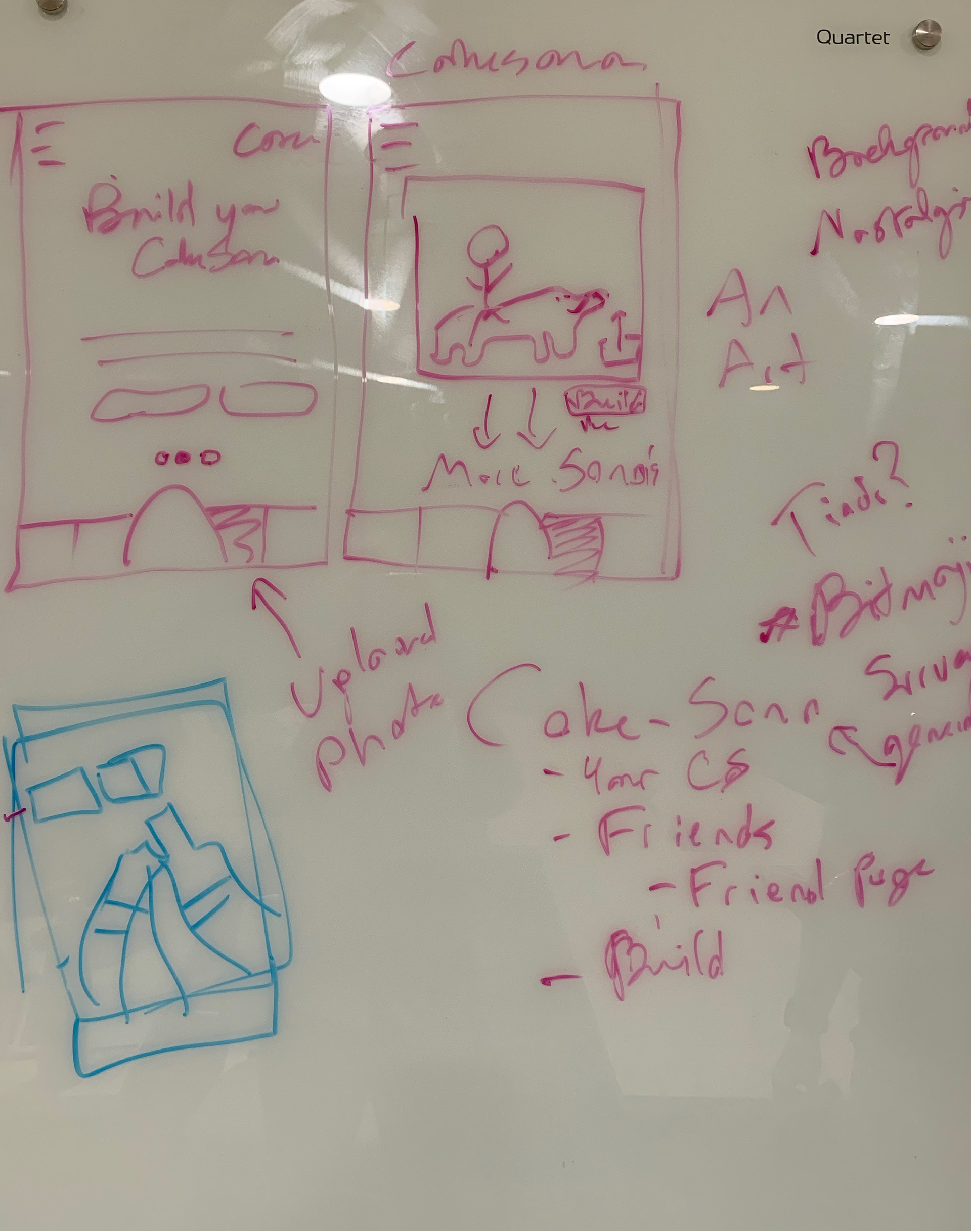
A proposed "Coke-Sona" idea
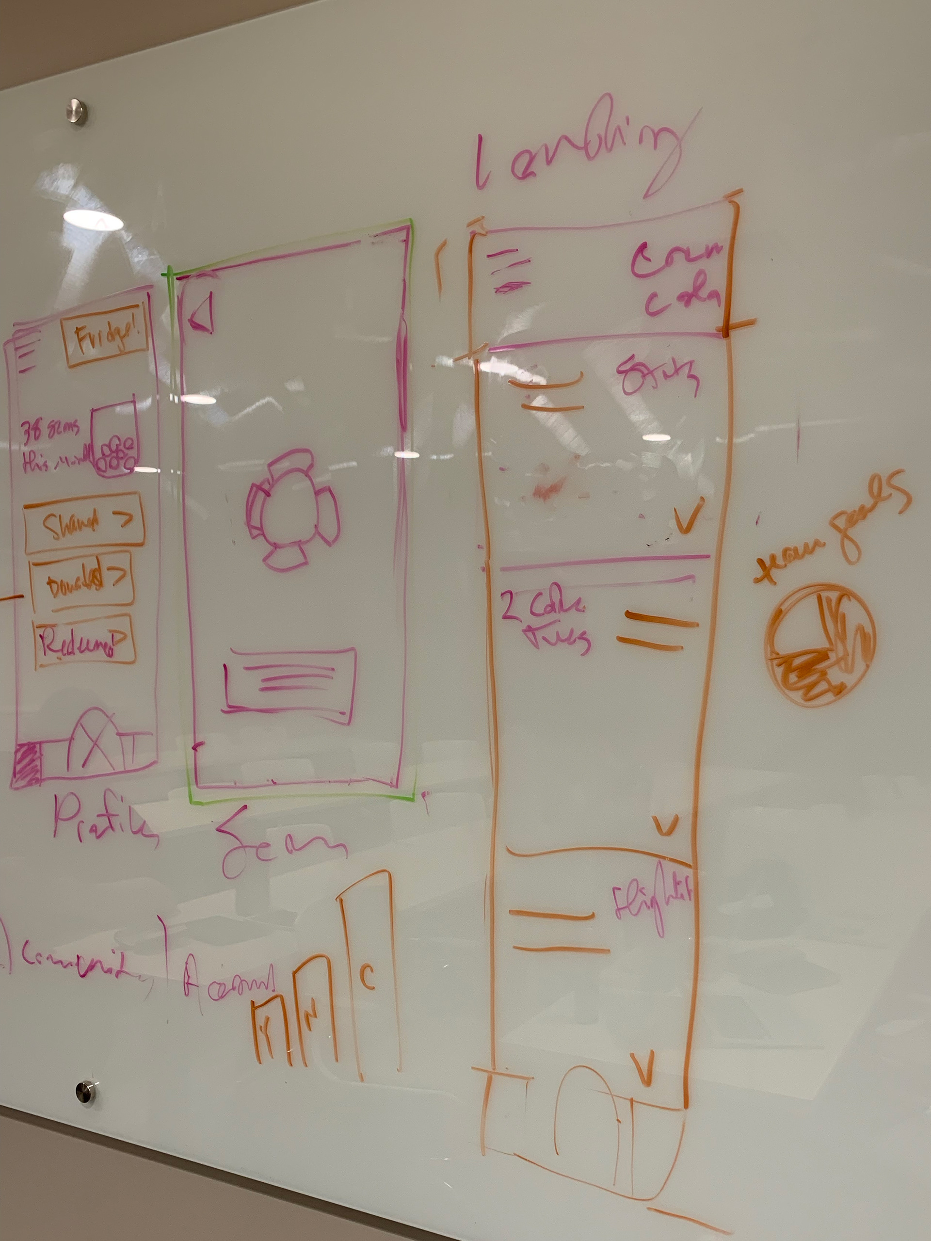
Ideating the home page
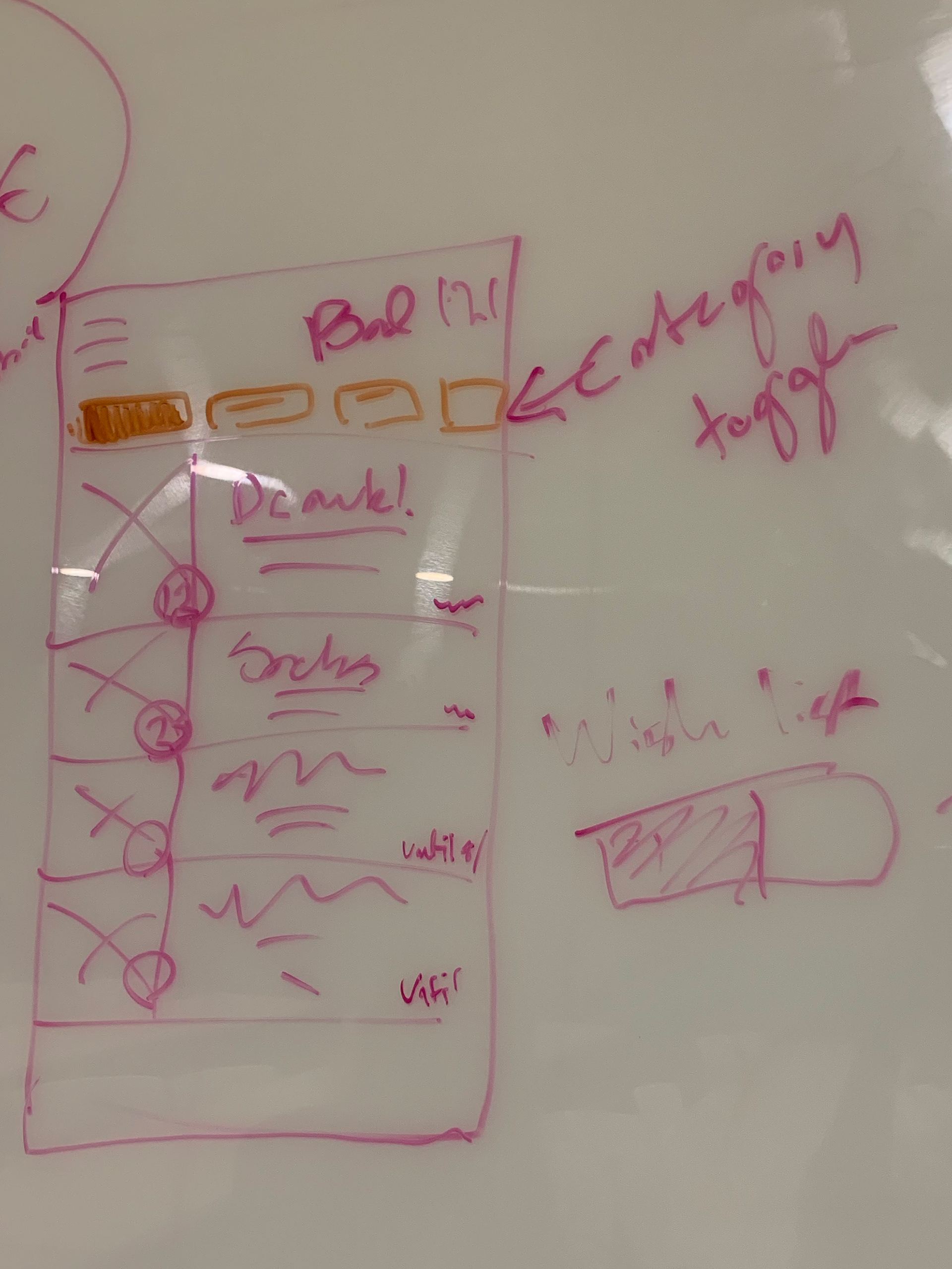
Selecting features for a rewards page
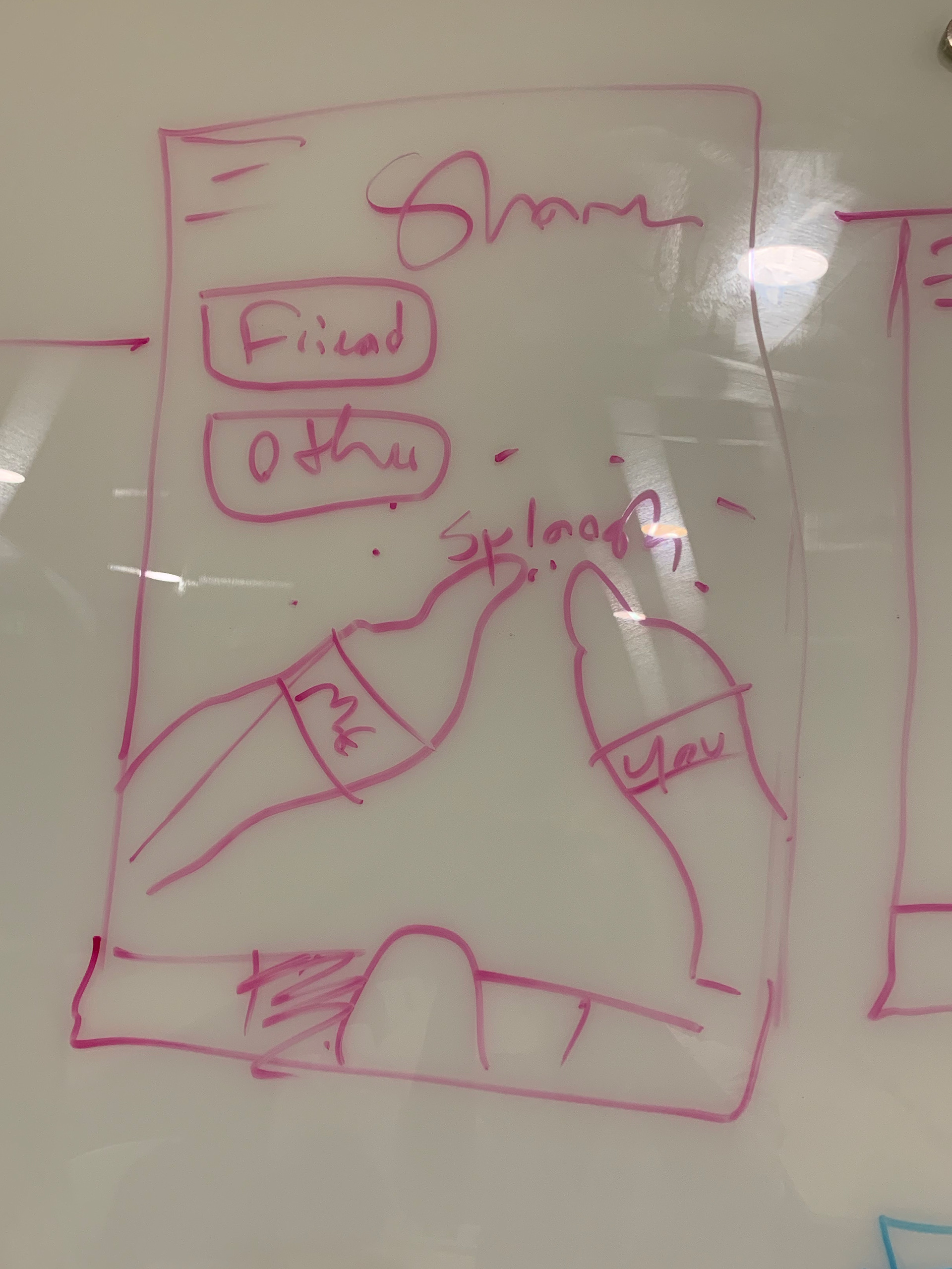
A new key feature to Share a Coke
Our team took turns building medium-fidelity components in Sketch. My colleague Julia Baker Hansen took our models and brought them into high-fidelity by building out the UI in Sketch. I made a prototype in InVision using her wireframe.
To address the needs we uncovered in our research, we mapped out two user flows:
For Cole, our power user, we imagined him donating some points to a charity he supports using the 'Share a Coke' feature, checking his balance, and then seeing if he has enough points to order a personalized six pack. Turns out he doesn't - but he's going to be buying more Coca-Cola soon, so that's okay. With all of these ways to get involved with Coca-Cola and to share his experience with others, Cole can feel much more connected to the brand he loves so much.
For Rebecca, our aspirational user, we imagined her creating an account with Facebook, checking out the homepage features, and then jumping right into scanning a barcode and redeeming a reward. We aimed to make it possible for her to do this as quickly as possible while also adding that instant gratification element so she doesn't feel like her time is being wasted.
With these flows in mind, we built a prototype in InVision to tell the our users' story.
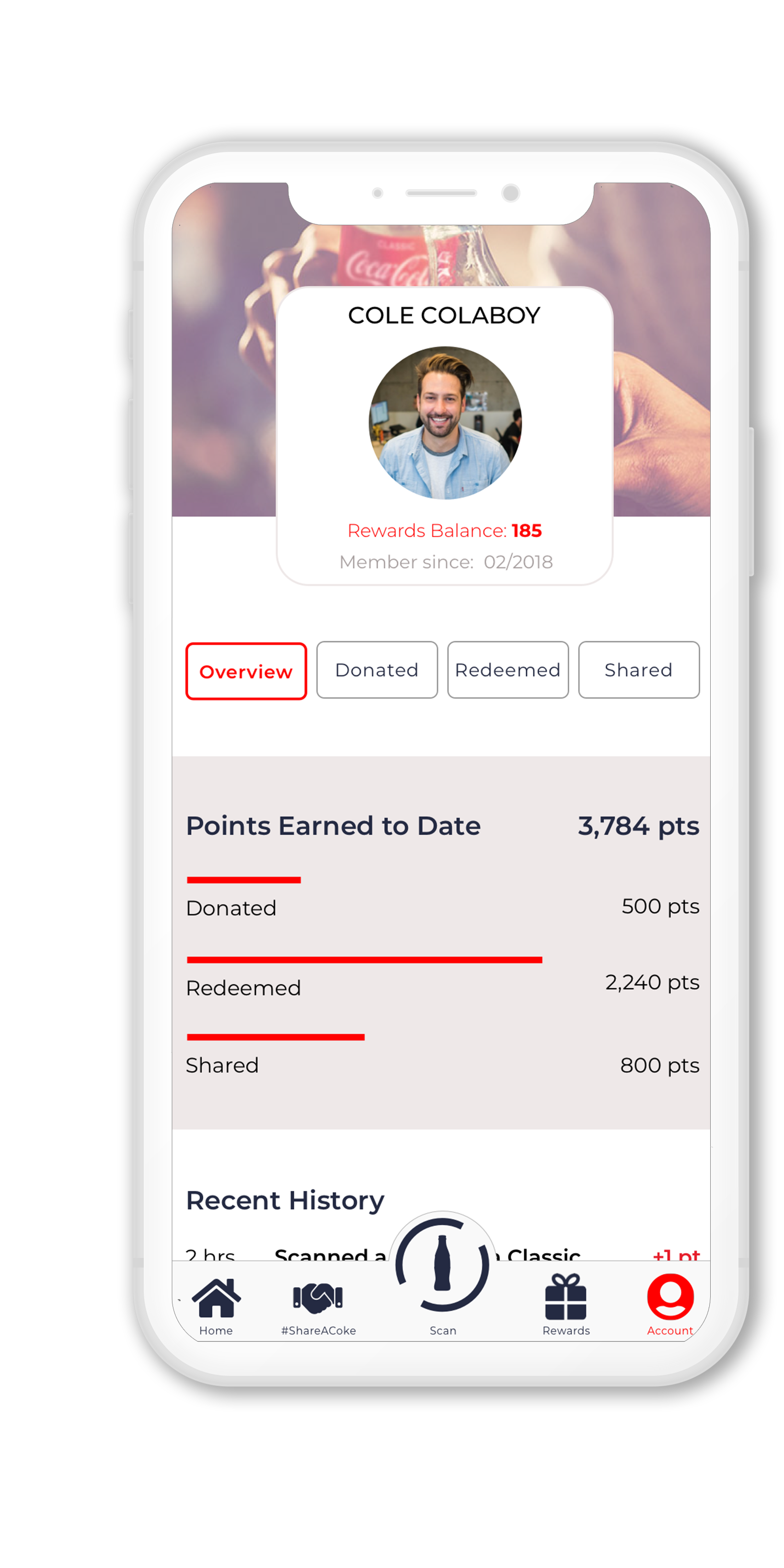
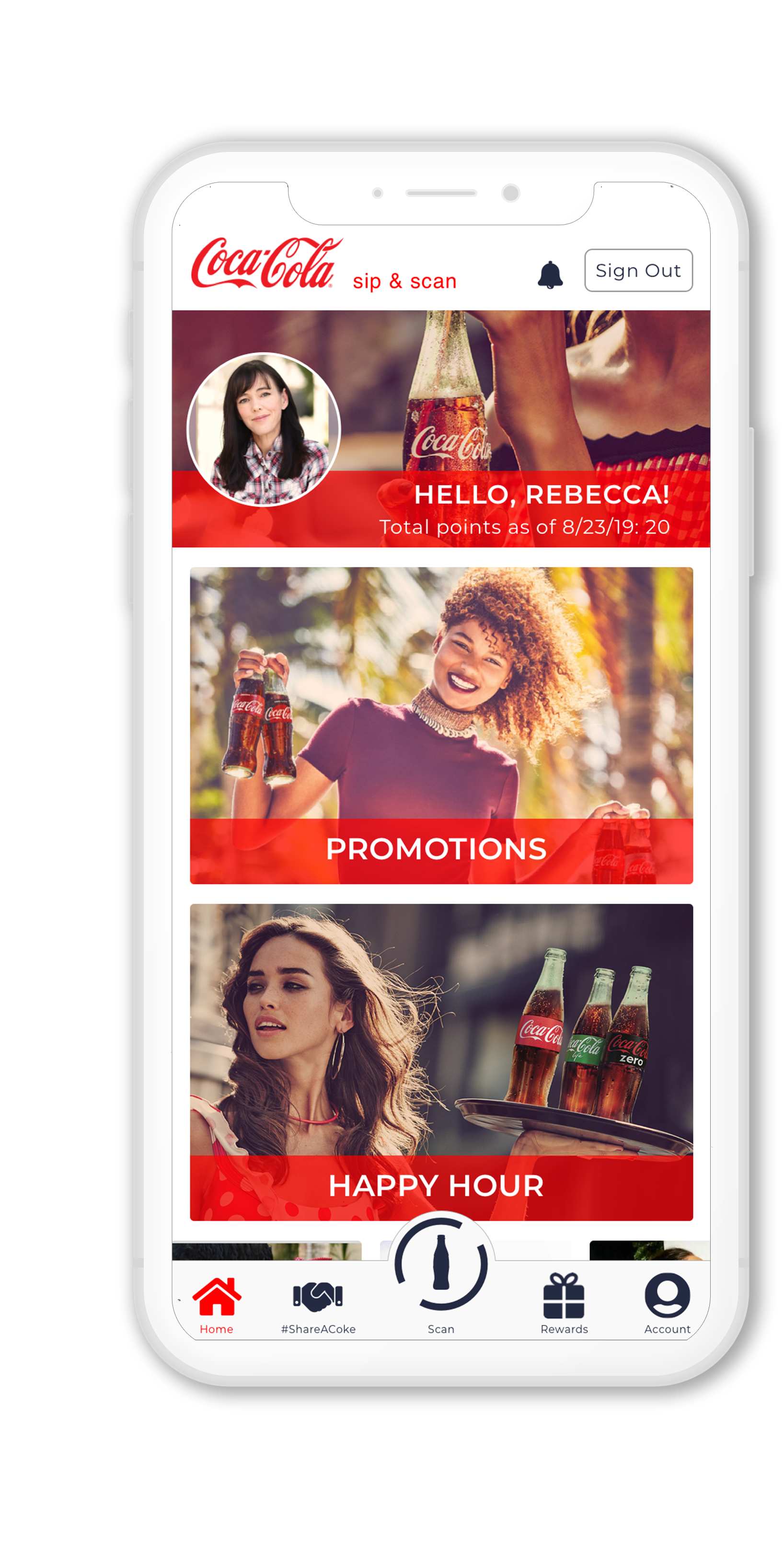
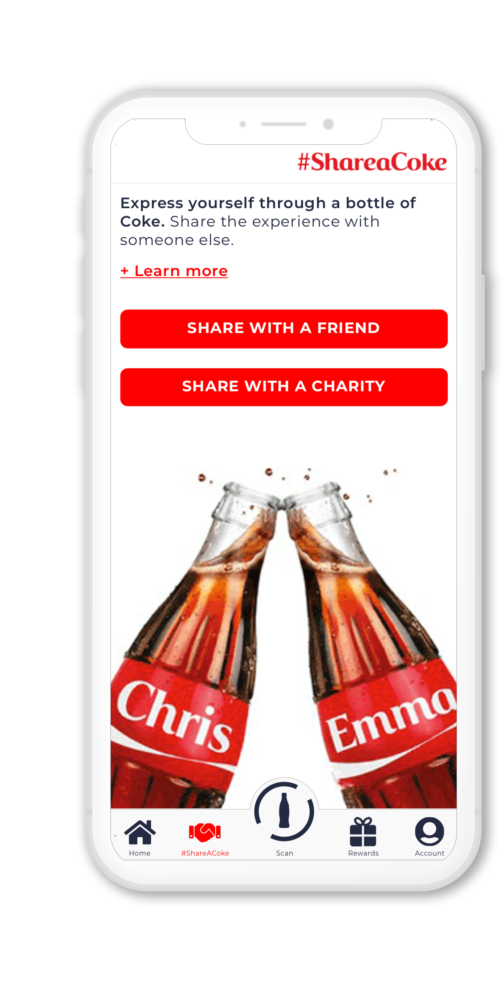
After usability testing of the prototype, we identified and fixed some issues with the concept:
• Renamed the '#ShareACoke' feature from simply 'Share.' When asked to donate points by sharing with a Charity, users were not able to make the connection that donation was part of the Share feature and assumed that the button was for social sharing.
• Users had trouble finding the favorites section which initially was lower in the hierarchy of the Rewards tab - so we bumped it to the top. This would allow users to more quickly order their favorite items.
• Users were getting lost at times trying to complete tasks because the homepage feed was full of images that distracted them from the button bar at the bottom. We adjusted the visual hierarchy of these elements to keep the features from getting lost.
So how does our proposal stack up?
When we had potential users use our prototype, they appreciated the clean and cohesive design. They found the features of the prototype significantly more rewarding than the existing app: instead of entering a handful of contests with minimal chances of winning, users can see their balance grow and exchange it for their favorite merchandise, or share their love of Coca-Cola with their friends or community.
