Project
Address usability issues on a non-profit's website
Role
UX Strategist, Information Architect
Time
3 weeks
Tools
Sketch, Google Analytics
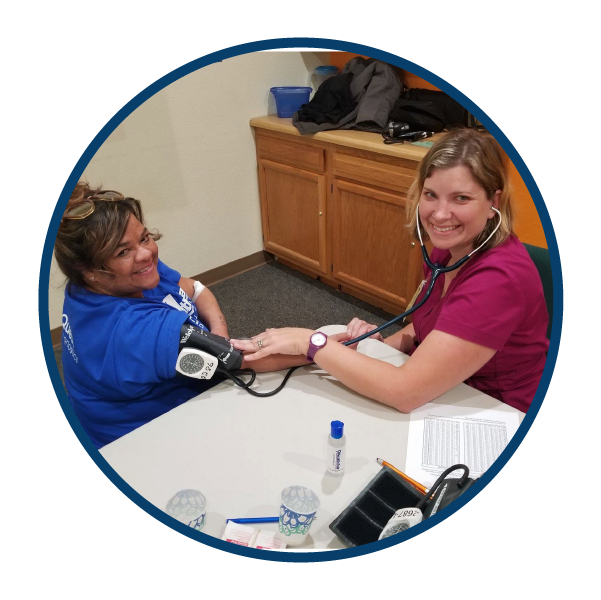
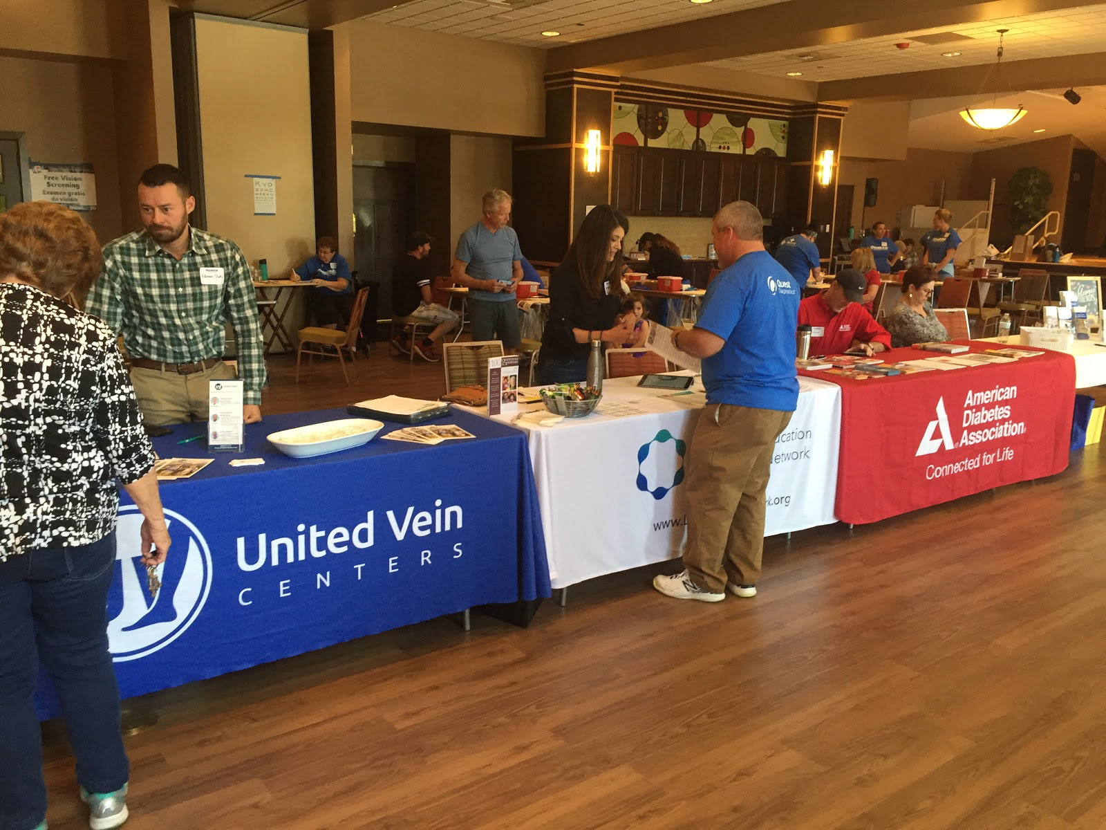
Meet 9Health!
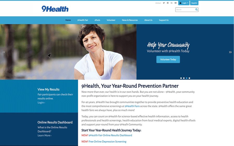
9Health is a non-profit in Denver, CO that organizes health fairs around the Colorado. These fairs have allowed community members to access affordable health screenings for over 40 years.
Our challenge:
They are rolling out a new online portal that will give their participants a new tool to track their test results and view their changes over time. However, this portal is part of a website structure that has some design issues. 9Health wants to improve usability of their site so users are more comfortable using their digital tools.
So what's the problem?
9Health approached our team of 6 with a number of issues. We identified the following 2 as the most impactful to their business neadsthat we could address within the timeframe given:
• Increase user flow to the donation page
• Reduce the amount of time it takes users to register for a health fair
In order to help understand their website and user base, 9Health also provided us with the following:
• Their branding and style guidelines
• Access to the Google Analytics for the website
• Prior focus group research they've done with their participants
Key Issues
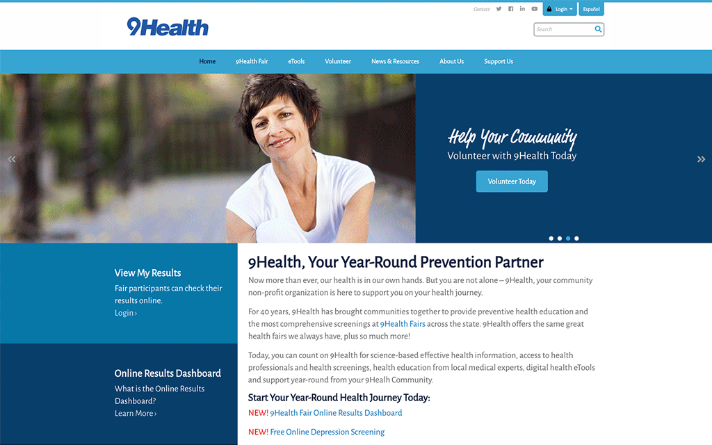
Our heuristic analysis of 9Health's website, identified some problems:
• There is an overwhelming amount of information.
• Several key pages have necessary information loading below the fold
• The tasks most important to 9Health's business goals are difficult to locate
To start addressing the other issues of the site, our team took turns redesigning the homepage and brainstorming new layouts that would streamline these important processes and address some of the heuristic issues in a design studio.
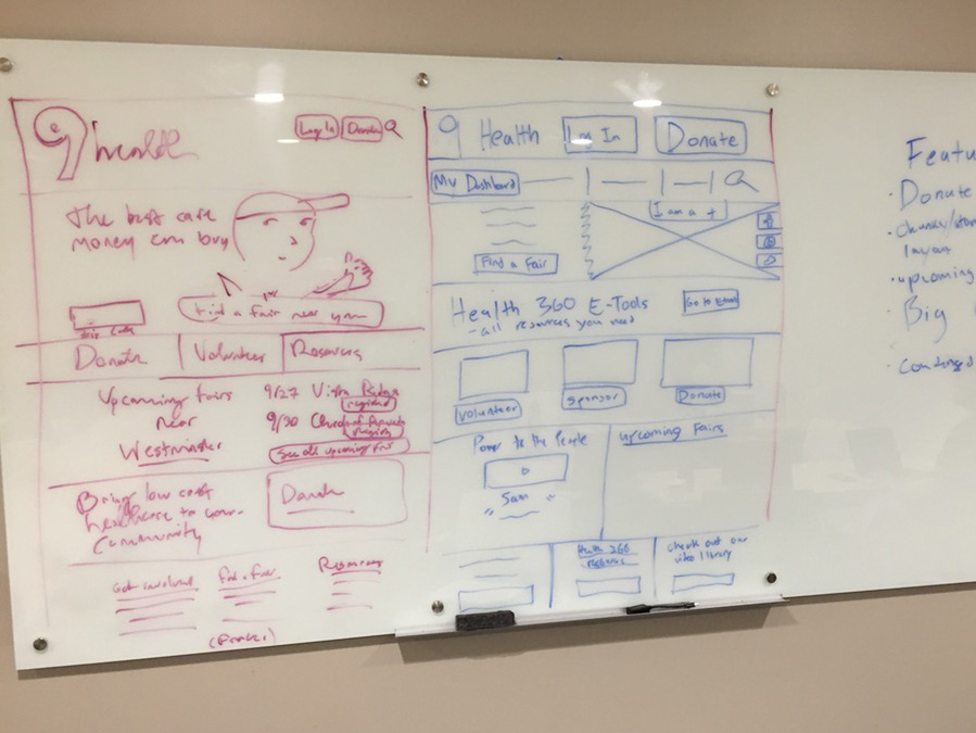
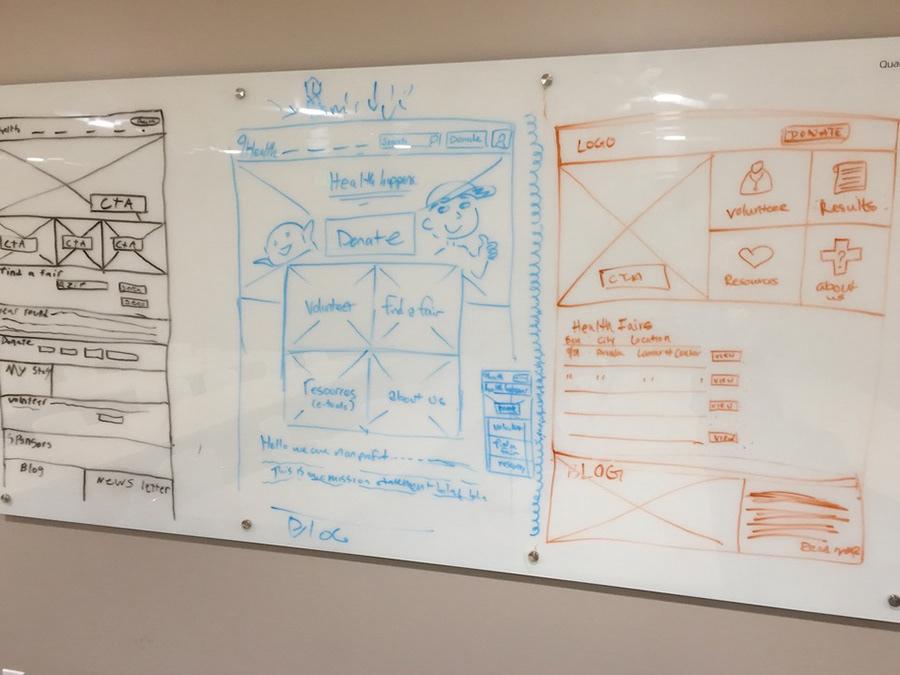
We then brought our ideas together into a single sketch, and then a wireframe.

Our Product Manager and UI designer, Kevin Mackin, brought the homepage into high fidelity.
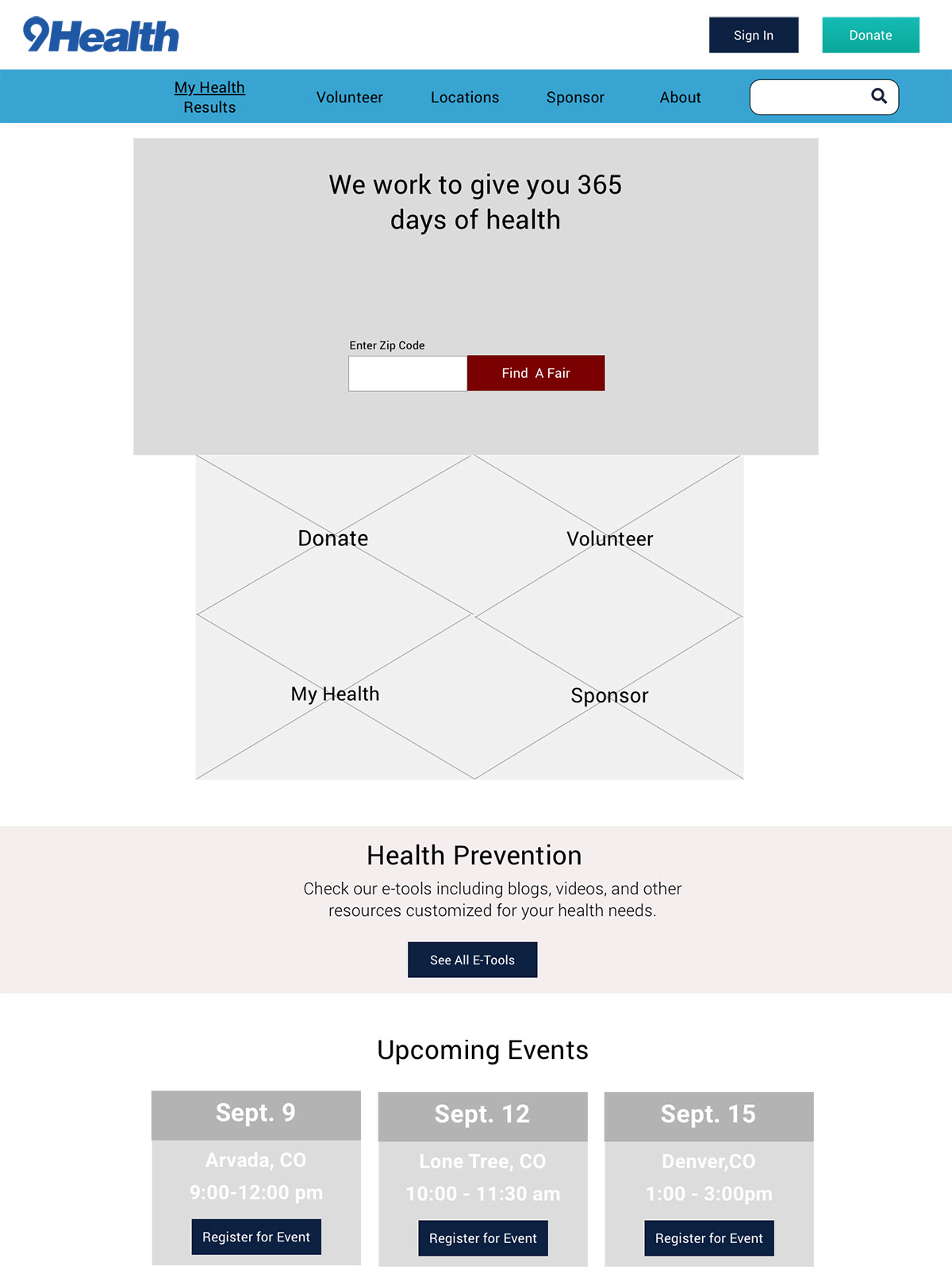
Our new homepage improves upon the previous version in a number of ways:
• Clear calls to action right at the top of the page get users where they need to go as quickly as possible without getting lost below the fold
• A significant reduction in text and unnecessarily distracting content
• An improvement in the overall visual hierarchy to improve navigation

How might we increase donations for 9Health?
The next issue we set our sights on was the donation flow. On the existing website, the actual form to donate is unintuitive to navigate to.
We confirmed that this is an issue for existing users. According to their Google Analytics, the donation form is one of the least visited pages on the website. It had received fewer than 1,000 visits in 2 years, comprising only 0.32% of all page visits (out of approximately 350,000 site visits during that period).
Additionally, we found some heuristic issues with the form itself:
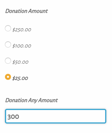
• The radio buttons and custom donation field can remain simultaneously active
• The submit button does not reflect the balance that the user is about to donate, and neither does the checkout/confirmation screen
• Credit card is currently the only option for payment
What are we doing right? What could we do better?
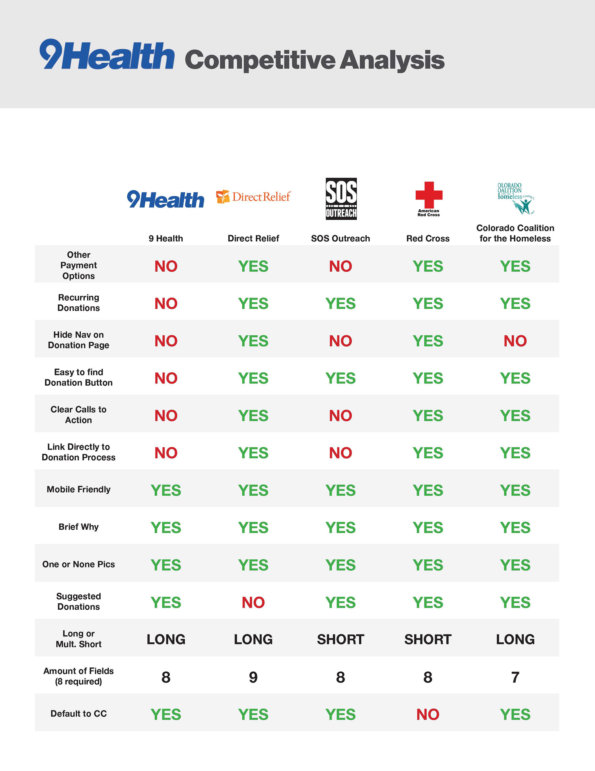
We researched common UI patterns for non-profits, doing a competitive analysis comparing 9Health's donation page and flow to other nonprofits using a list of a dozen recommended UI standards. We found that 9Health was only following about half of them:
Our approach to addressing this issue was twofold:
1. Make it much easier to find the donation form
2. Redesign the form itself according to existing UI standards
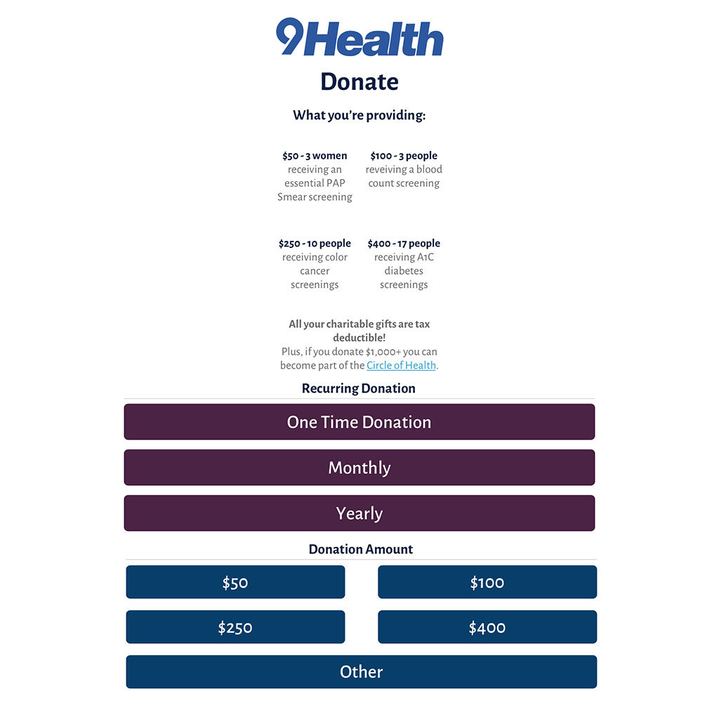
In regards to the first point, we included in our homepage redesign multiple references to donating:
1. A large call to action at the top of the homepage and a button in the header that will appear on every page
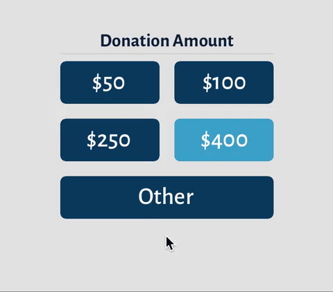
2. A simpler call to action widget allowing users to pre-select a donation amount before navigating to the form
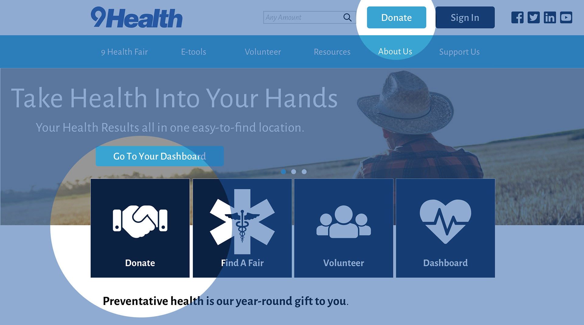

Additionally, all of these links navigate directly to the donation form instead of text-heavy pages describing the benefits of donating, eliminating unnecessary steps in the user flow.
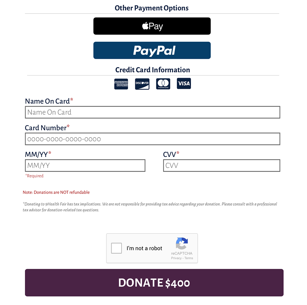
In regards to the second point, we updated the form to make the following changes:
• Corrected the donation amount selector
• Added additional options for payment as well as an option to set up recurring donations
• Added confirmation of the amount to be donated in the submit button as well as in the confirmation page
• Removed the header and footer from the donation page to keep the user focussed on completing their donation
With all of these updates in our prototype, we tested how long it took users to find the donation form.
On 9Health's original website, it took users an average of
11.8 seconds
To find the donation form
On our updated prototype, users only took about
2.8 seconds
To find the donation form
Putting the donation form front and center allowed users to get to the donation form 4 times faster than with the existing website. We expect this will increase flow to the donation form in addition to increasing donations for the organization.
How might we make it easier for users to sign up for health fairs?
Understanding our Users
Health fair registration is very important to 9Health's business objectives. They make most of their income from the fees that participants pay for select services. For this reason, we wanted to make it as easy as possible for the users to complete this task.
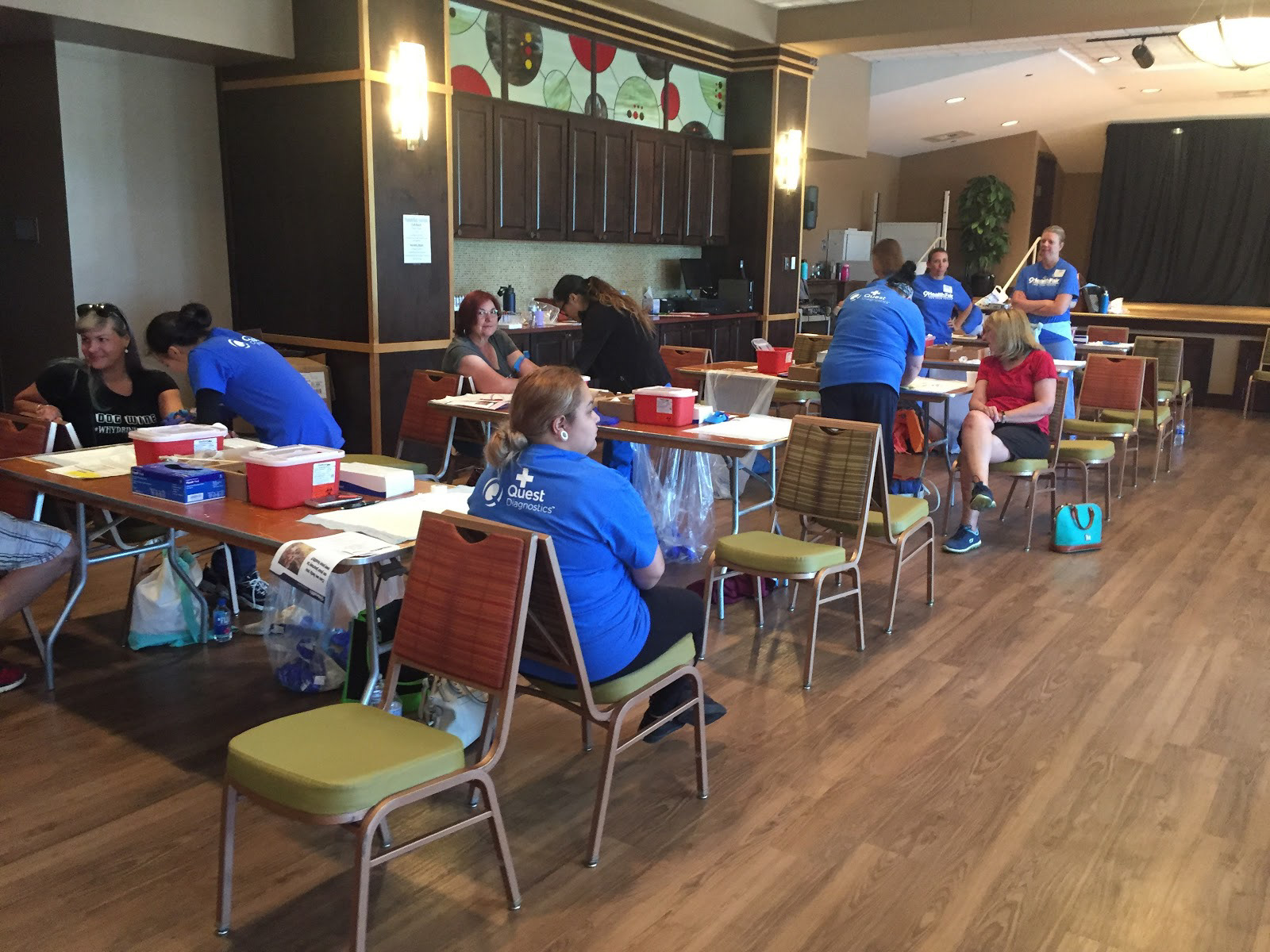
In order to come up with our own impression of 9Health's users, 2 of our team members visited two different health fairs in Aurora and Arvada. It was important for us to understand the participants as well as how the fairs operate.
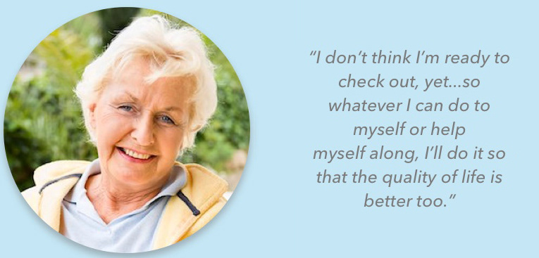
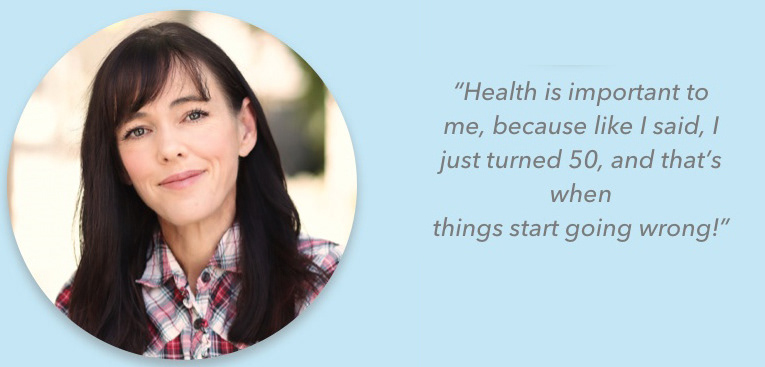
Based on 9Health's own research and the conversations we had at the health fairs, there are two primary users:
Older participants (in their 60s and older) enjoy the fairs because they are affordable and convenient. They are also motivated by being able to get care in their own community and the assurance of checking off all the tasks from their preventative care to-do list.
Younger participants (in their 40s and 50s) attend because of the low cost of care and are also likely to be motivated by issues in their family history. Many of the participants we spoke to said the online registration portal was frustrating to find and use.
According to 9Health, the older participants make up the majority of their users. Many of those do not pre-register on the website, but rather in-person on the day of the fair. In order to make the fairs more appealing to the younger demographic, 9Health wants to make the sign-up process as easy as possible.

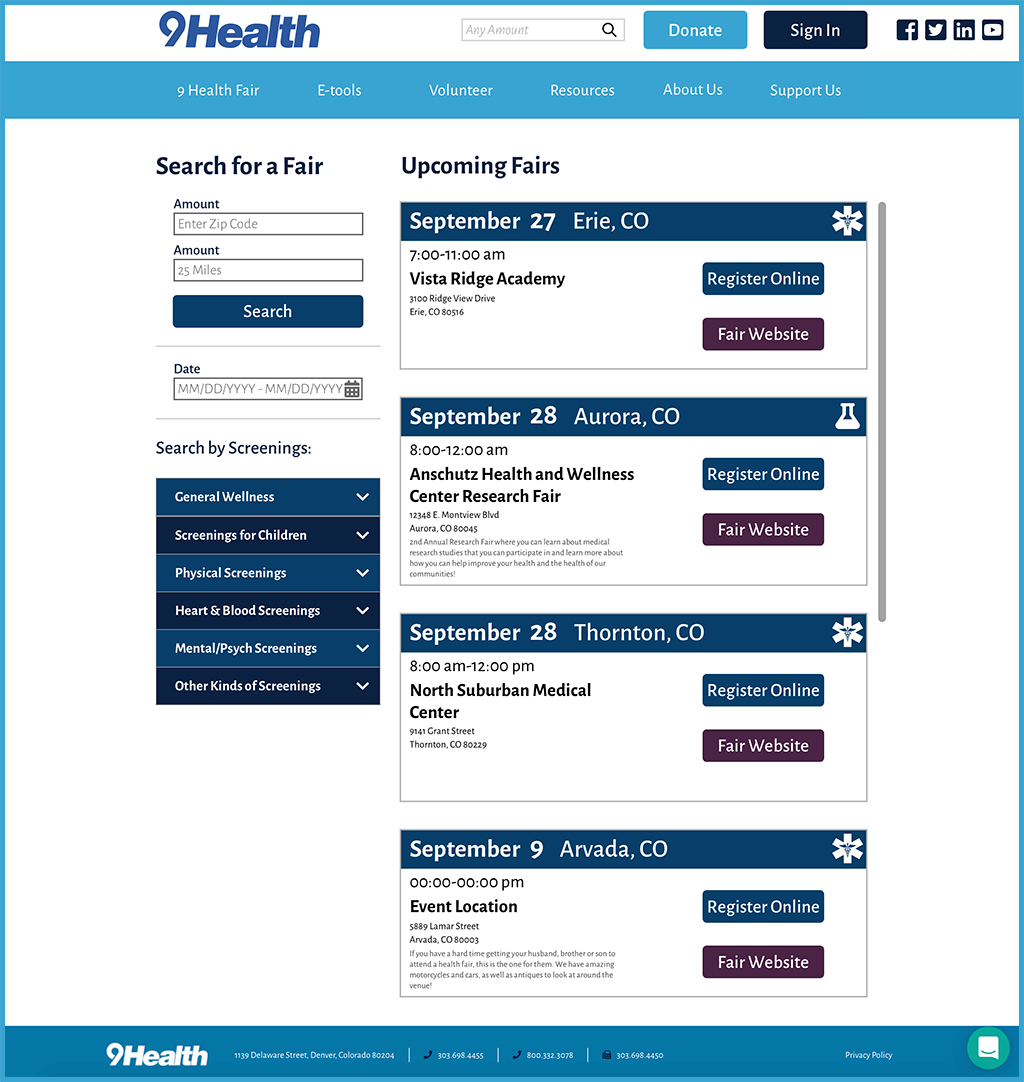
Fixing the Find a Fair Page
For this flow, we focussed our efforts on the find a fair page of 9Health's main website. The actual registration flow itself is part of a separate portal that is hosted elsewhere and is tied to the portal that 9Health is launching.
Our own heuristic analysis of the flow resulted in the following:
• The find a fair page itself is difficult to find
• The search page does not auto-populate with results
• Search results populate below the fold and, according to the analytics, users would not see them and exit the website
• Search results default to only a 5-mile radius which restricts the fair results, and the filter to adjust this is visually difficult to locate
We redesigned the page to include the following solutions:
• The find-a-fair page is one of the calls to action on the homepage
• The search page loads with results, pre-populated above the fold
• The filters are designed more accessibly, with settings easier to read
As with the donation flow, we tested how long it took users to find a fair and get to the registration form in both the current website as well as our updated prototype. Here's what we found:
On 9Health's original website, it took users an average of
4 minutes 21 seconds
to find a fair and get to the registration portal
On our updated prototype, it only took users about
45.7 seconds
to find a fair and get to the registration portal
Users completed a search and got to the registration form more than 5 times faster than with the existing website. We expect this will increase flow to the registration portal, increasing the number of users who complete the process and show up to fairs.
What else can we address?
There were a number of other issues 9Health raised with their website. While we focussed mainly on the donation and fair registration flows, we also included additional recommendations to improve usability.
Information Architecture
One of the issues we kept bumping into is that key features of the website were buried in what the organization itself called a 'megamenu.' There are so many pages in the navigation that finding what you actually want requires some digging.
Page by page, we performed a card sort to identify pages that could be consolidated/removed, renamed for clarity, or re-categorized more logically.
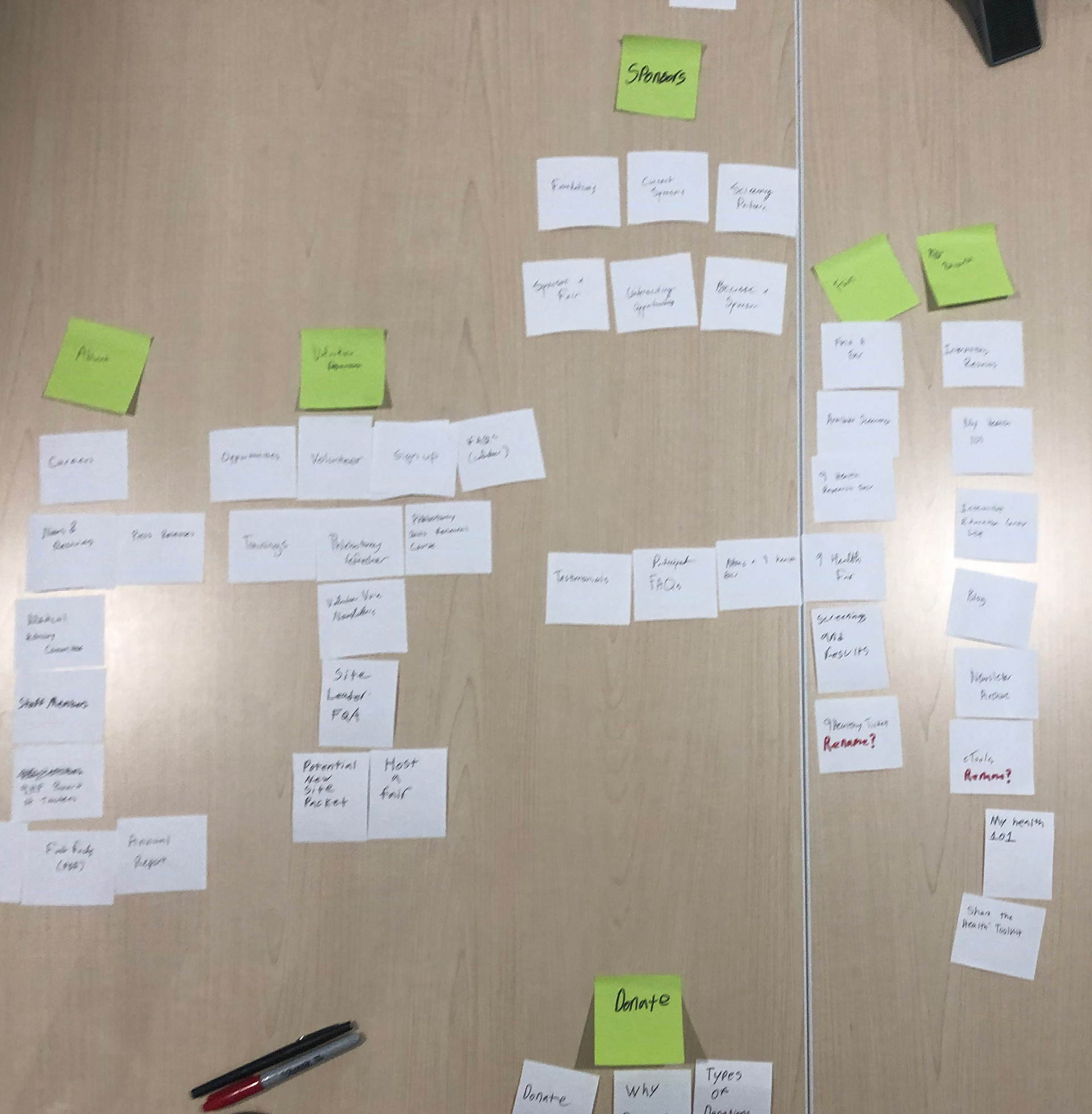
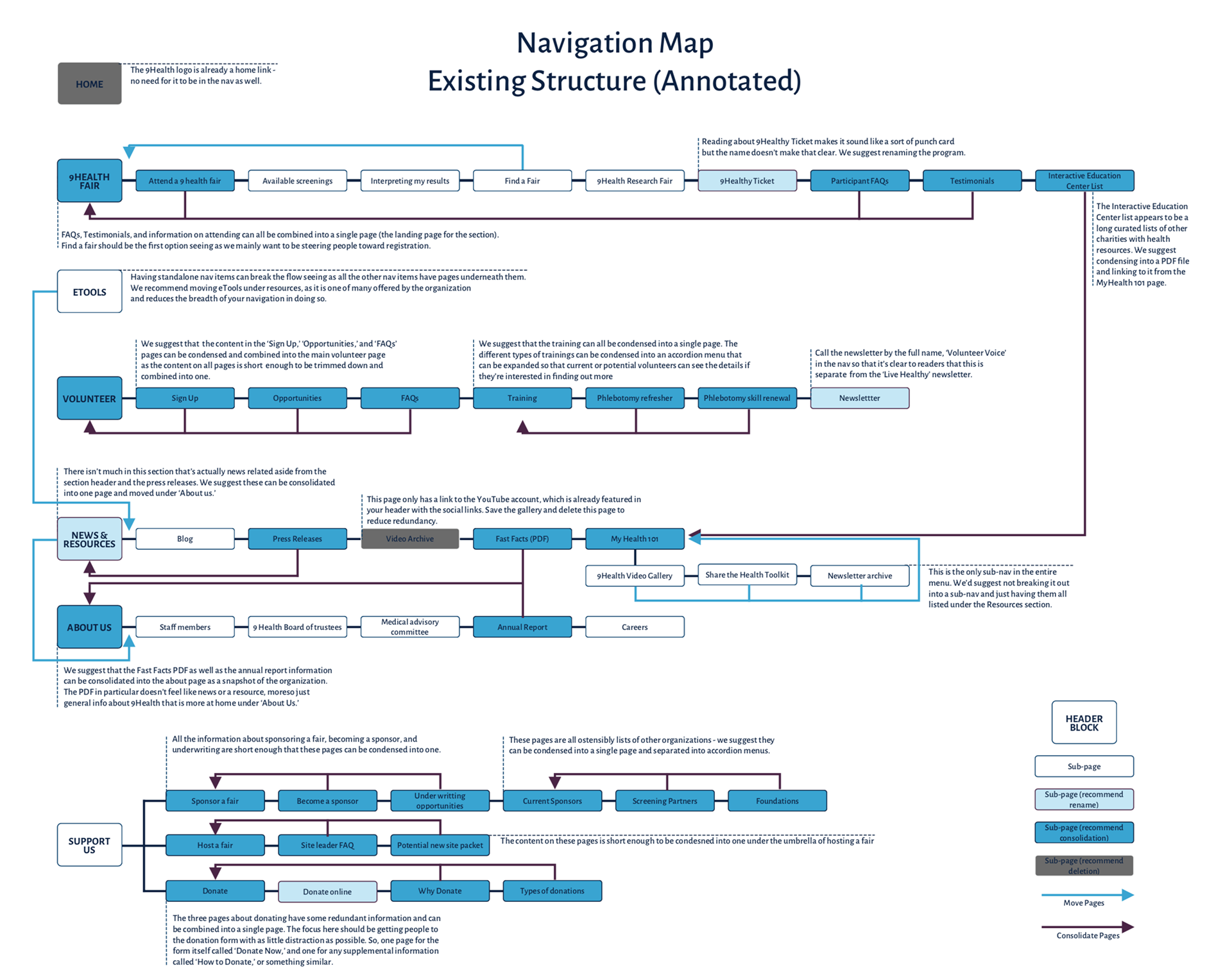
We included an annotated version of the existing navigation...
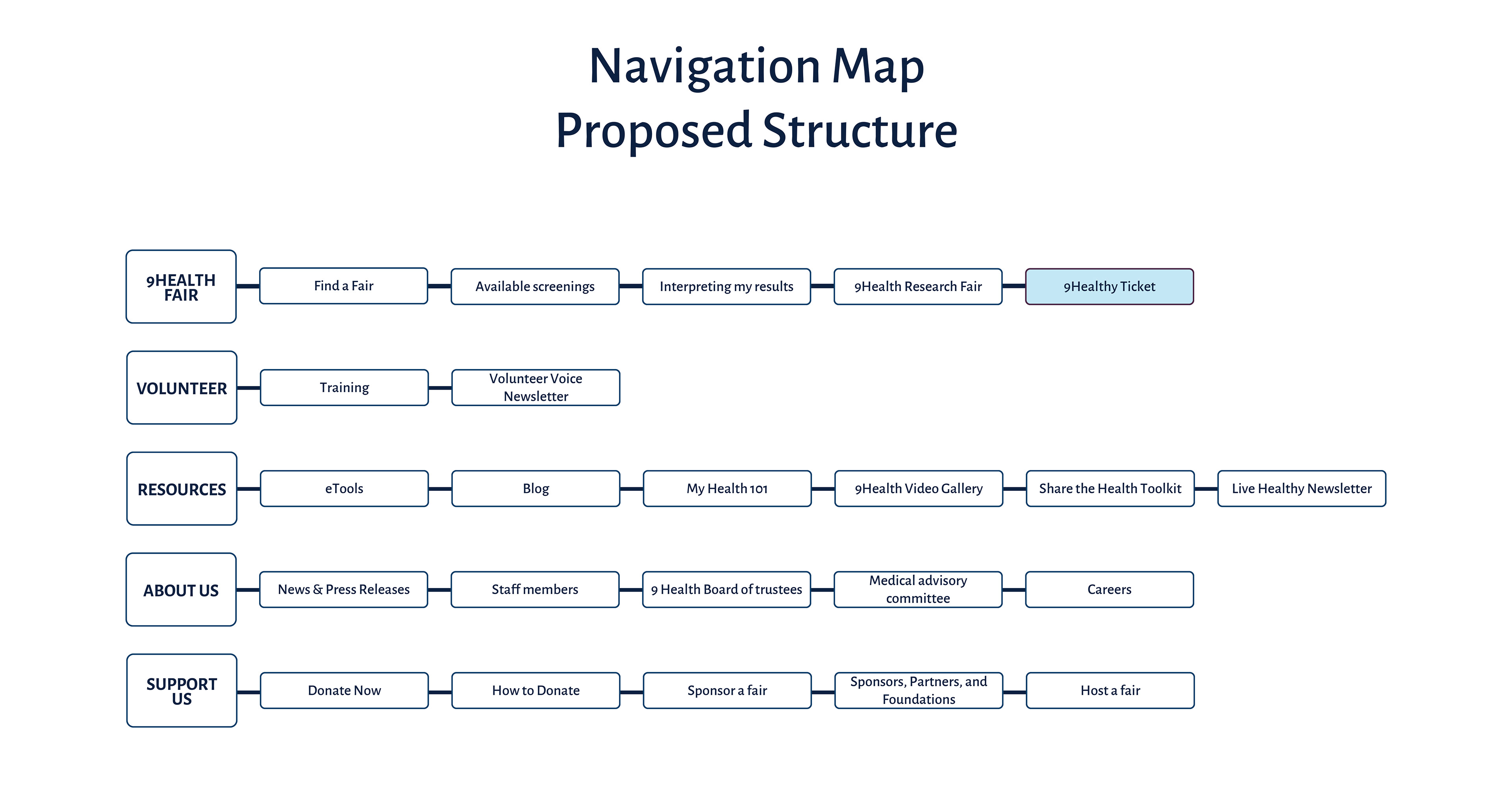
...As well as an updated navigation structure if all recommendations are made.
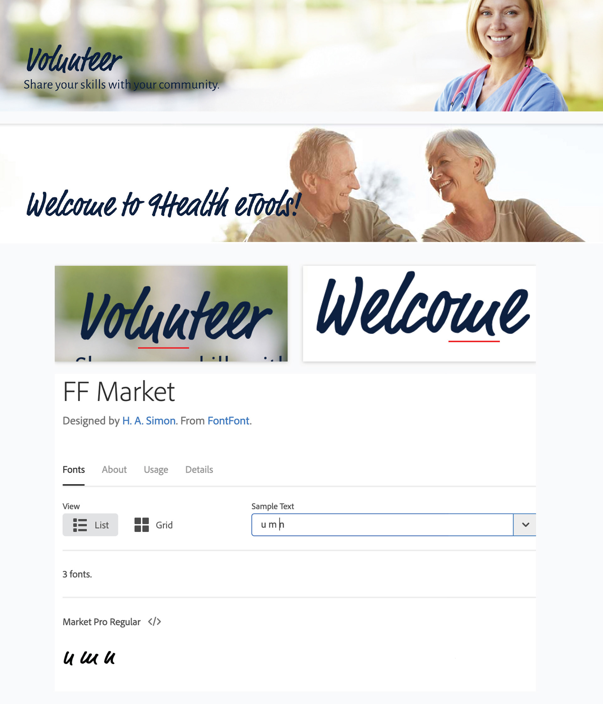
Typeface
One of the brand fonts has some legibility issues. It's called FF Market, and certain similar letters (n, m, u, w) look practically identical and can be hard to differentiate from one another in places.
Because changing it would affect many aspects of their website and style guidelines, we detailed the issue in a separate deliverable that we included as a recommendation in our pitch deck.
Next Steps
We presented our recommendations and test results to 9Health stakeholders and handed over a pitch deck. They were very excited about the possibility of what some simple changes to their website can do for their users, and are taking our recommendations to their in-house developers for implementation.