
Meet TOTAGO!
TOTAGO is an early-stage startup with a mission: they want people to Turn Off the App and Go Outside. Compared to other outdoors apps, TOTAGO aims to get people outside by any means necessary. Your local park is as important a goal as that class 5 summit that's a four hour drive from town, and the outdoors should be accessible to everyone whether you drive or take the bus.
The Challenge
TOTAGO started as a web app, and their mobile app was developed as an extension of it. I undertook an effort to redesign their mobile app to make for a much more fluid experience for their users, as well as to build a visual language that complemented their brand and was easily translatable across their apps.

Part 1: Modern Hiker
The team behind TOTAGO manages a handful of white label mobile apps. These use TOTAGO's platform and infrastructure while providing their own destination data. The look and feel of each app was different, and TOTAGO needed a universal template that could be easily translated, not only to the existing apps, but also any potential future clients'.
**Find old MH app screenshots?
What's the industry standard?
I started by downloading various outdoors and mapping apps, dissecting their UI, and comparing them to each other and to TOTAGO's apps to identify what they're doing right. I looked at the following data points:
• Each app's value proposition
• Supported activities (e.g. hiking, cycling)
• How the search and filter functions work
• The data points included in activity descriptions
• Any activity tracking or social features
• Each app's cost to use
• Supported activities (e.g. hiking, cycling)
• How the search and filter functions work
• The data points included in activity descriptions
• Any activity tracking or social features
• Each app's cost to use
I gained inspiration to fuel my wireframes and grew a deeper understanding of the solutions other companies came up with to address our problem.

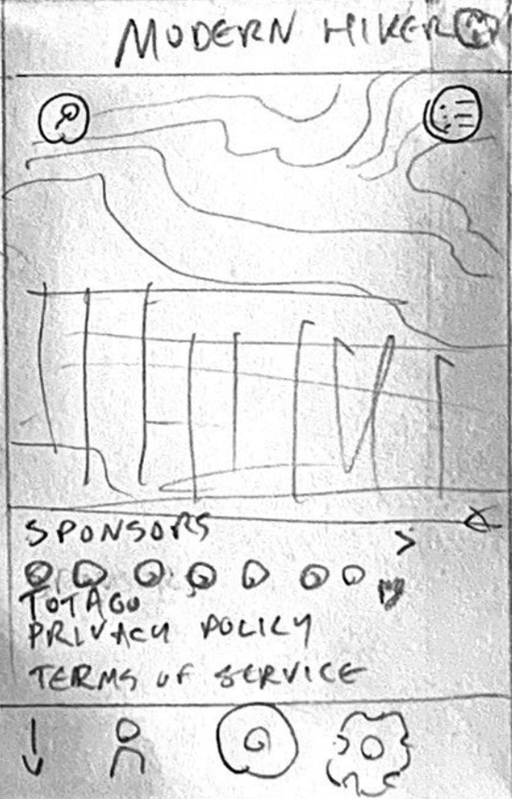
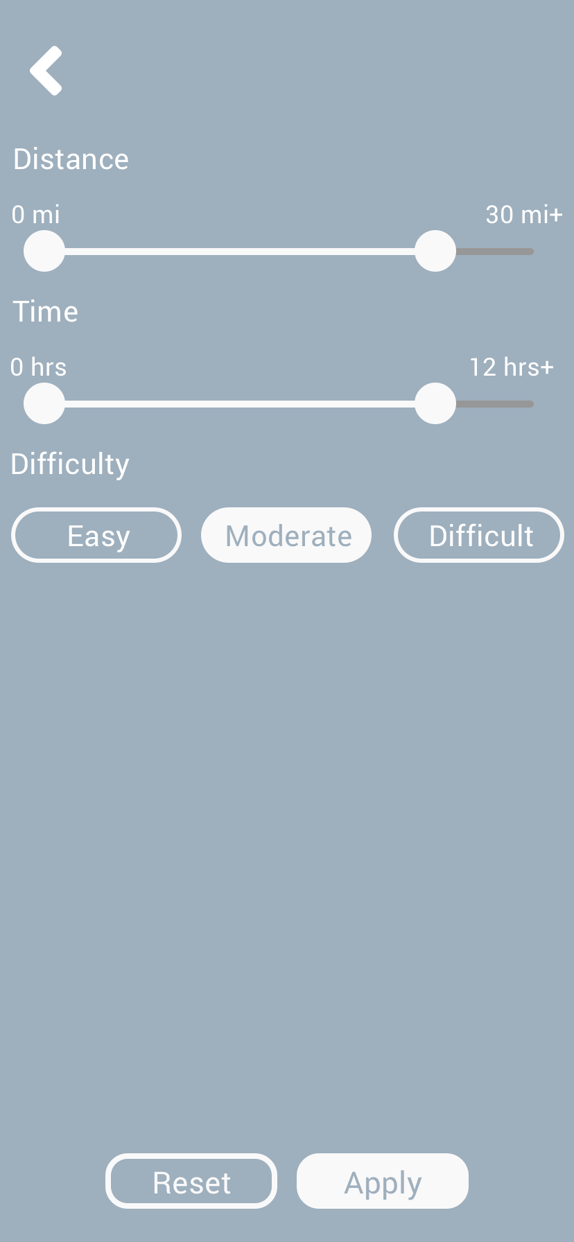
Once I had a better idea of the UI standards in other outdoors apps, I began drawing up low-fidelity mockups, focusing on 3 primary features:
• The home/explore screen
• The search screen
• The filter screen

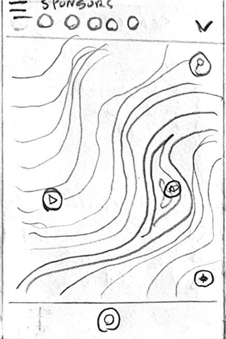


In particular, I looked at the search and filter screens of other apps. I found intriguing solutions for how search results are displayed in two of our closest competitors, AllTrails and Hiking Project

AllTrails lists all results in a single list, differentiated by icons

Hiking Project breaks results down
into categories.
into categories.
I presented my ideas to the CEO, and we discussed which ones were most feasible for the existing framework of the app. In the case of search results, he liked the category breakdown because it would be easier to implement within their existing framework. From there, I started wireframing to better illustrate my ideas.


Once the CEO approved my layouts, I continued to flesh them out into higher fidelity and made different color variations to reflect the branding of the other apps.

Part 2: Mapping Architecture
Card Sort
IA Study
Two icon sets
Icon BG
Font Icons
Mapbox prototype
Style Guide (Sprint 2)
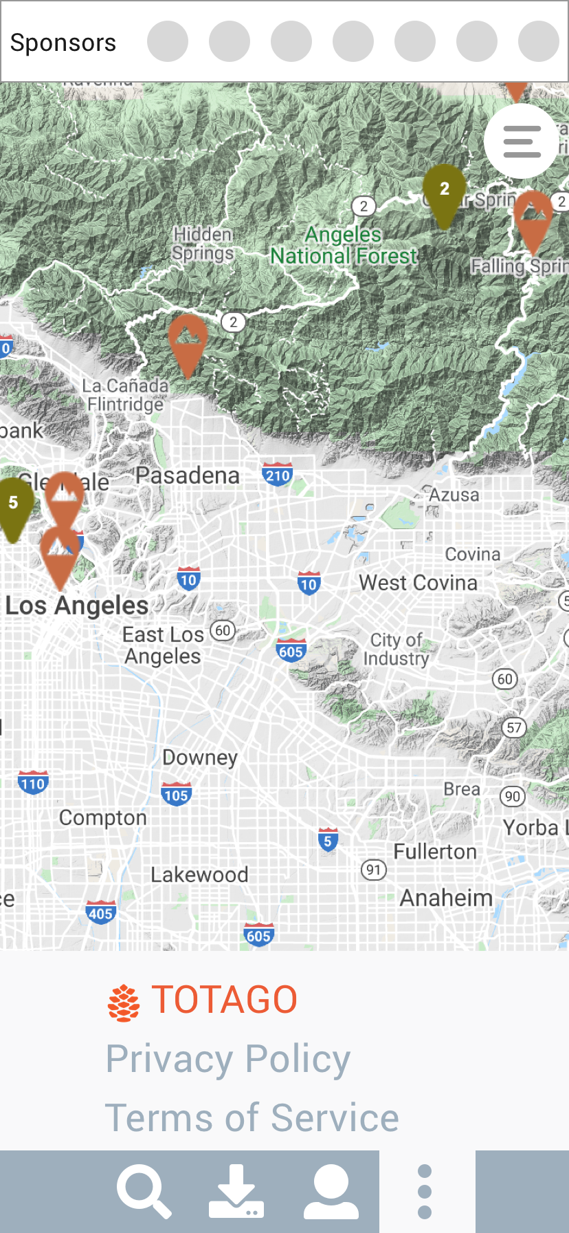
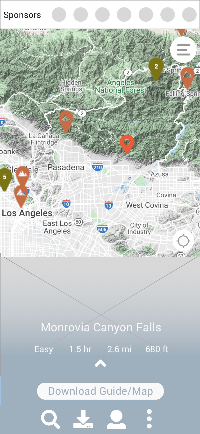
Screenshots of current wireframe showing pins on the map
Part 3: TOTAGO
Old app screenshots? (Sprint 2, web app/mobile)
TOTAGO wireframe, prototype
Feature highlights
-DDP Contexts
--Verified/unverified
--Premium trips
--Businesses/Points of Interest (no quick facts)
--Destination preview
-Activity Log
Update on the wireframe to ‘light mode’ screens:
-Trip planner screens (4x)
-Profile
-Saved trips
TOTAGO web wireframe/prototype
-Dark mode/light mode?
App Store Mockups